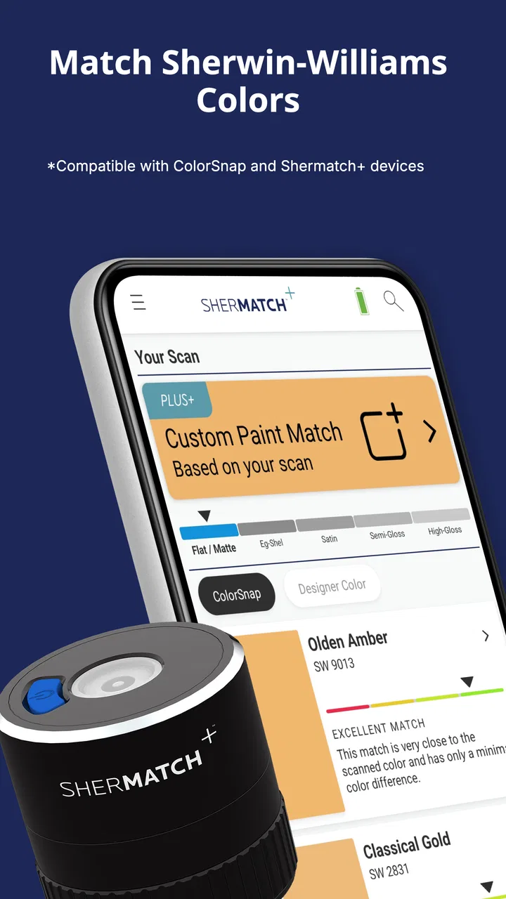
SherMatch+ by Sherwin-Williams
- 3.6
- Rating
- 500.00K
- Installs
- Free
- Price

 Analysis by App-foxy
I tried SherMatch+ while planning a room update, and my first impression was that it is most useful when color decisions need to happen in the actual space rather than on a tiny paint chip. The app belongs in the House & Home category, is free to install, and comes from Variable, Inc. It was previously known as ColorSnap® Match, but the current focus is a more professional approach to color and sheen matching with SherMatch+.
That change in emphasis matters. This is not simply a gallery of attractive rooms or a basic paint calculator. I see it as a practical companion for narrowing down a finish choice, checking how a wall color relates to nearby surfaces, and giving several people a common visual reference before anyone buys paint. It is especially handy when a household is comparing colors in a hallway, bedroom, kitchen, or shared living area and wants something more concrete than passing around sample cards.
Using it when several people are choosing a room color
A realistic use case is a weekend decorating decision. One person may be holding a fabric swatch, another may be comparing the wall with the floor, and someone else may be trying to imagine whether a finish will look too flat or too reflective. Instead of relying on memory, I would use SherMatch+ as a shared reference point while standing in the room.
You May Also Like

 Blood Strike: 2.5 Anniversary
Blood Strike’s Loadouts Turn Every Drop Into a Tactical Gamble
A close look at Blood Strike’s custom loadouts: how fast access to signature weapons reshapes its battle royale rhythm, rewards preparation, and narrows the gap between fights.

 Pandora - Music & Podcasts
Pandora’s Music Is Easy to Start, but Harder to Recover
Pandora’s strength is its low-effort path from a seed to a station. Its weak spot is how much confidence it asks you to place in connection, setup, and quiet recovery.

 8 Ball Pool
 Is Built on Rivalries, Rematches, and Routine
A close look at the rivalries, rematches, shared routines, and unanswered safety questions that turn a quick pool match into a persistent mobile community.

 Samsung Music
’s Quiet Strength Is Playing What You Already Own
Its reach comes less from spectacle than from dependable access to a personal library. That simplicity is both the app’s strongest retention engine and its ceiling.

 AccuWeather: Weather Radar
AccuWeather Review: A Quick, Clear Forecast for Everyday Decisions
For everyday plans, the best forecast is the one you can understand quickly. AccuWeather makes rain timing, radar, and local conditions easy to act on, with a few trade-offs.

 Hill Climb Racing
Why Hill Climb Racing Still Turns Crashes Into One More Run
A tiny car, a bumpy hill and one more upgrade: Hill Climb Racing keeps resurfacing because its simple chaos makes every near-miss feel personal.
More From Our News Desk



The useful habit is to treat the phone view as a conversation starter, not as a final promise. Lighting changes throughout the day, and a camera cannot perfectly reproduce the way paint will look after it dries across a large surface. I found the app more valuable for eliminating obviously unsuitable options than for declaring one color unquestionably correct.
That distinction prevents a common mistake. A shade that looks balanced on a screen may feel warmer beside a wooden cabinet or cooler next to bright white trim. I would compare the same candidate from several angles, then check it again under the room’s normal lighting. If the household is split between two close choices, the app can make the discussion more focused, but physical samples still deserve the final word.
Because the app is free, it is easy for a couple, roommate group, or renovation helper to keep it available without making the first step a purchase. The presence of in-app purchases ranging from $4.99 to $47.99 per item means I would still review any payment prompt carefully before proceeding. The free starting point is attractive, but users should not assume every professional-oriented function is necessarily included without cost.
What I would do before handing the phone around
On a shared device, I would begin by deciding what the phone is being used for: browsing possibilities, checking a color in a room, or preparing a more serious matching session. That small boundary keeps the process organized. It also avoids the familiar household problem where one person changes the working choice and the next person assumes it is still the original option.
I would take a quick reference photo of the room before experimenting, making sure the important surfaces are visible. Then I would compare one area at a time rather than rapidly switching among many walls. This makes it easier to remember why a color was rejected. A cluttered screen full of near-identical choices can create more indecision than progress.
Another practical tip is to keep the phone’s display conditions consistent. If one person judges a color outdoors in bright light and another checks it under a dim indoor lamp, their reactions may disagree for reasons that have nothing to do with the paint. The app cannot solve that household coordination problem, but a consistent viewing routine makes its results easier to discuss.
I also recommend naming the decision in ordinary language when talking with others: “the warmer neutral beside the bookcase” is more useful than “the third option.” SherMatch+ can support the visual comparison, but people still need a simple way to refer to the choices. This is one of those small workflow improvements that saves time when several people are involved.
Account boundaries and shared-device expectations
For a household phone or tablet, I would not treat the app as a place to store private family information. Its job here is color and sheen matching, so I would keep the session limited to the room project and avoid passing around the device while unrelated personal apps or notifications are visible. That is basic shared-device hygiene, but it matters when neighbors, contractors, children, or visiting relatives are helping with a decision.
I would also make payment responsibility clear before anyone explores premium-looking areas. Since purchases are available inside the app, the person holding the device should know whether they are only testing the free experience or are authorized to buy something. This is particularly important on a phone used by several adults, where a casual tap can become an unexpected household expense.
There is a second boundary worth setting: visual matching is not the same as ordering or approving a renovation. I would use the app to prepare a shortlist, then have the person responsible for the project confirm the exact product and finish through the appropriate Sherwin-Williams purchasing process. That separation keeps an attractive on-screen result from being mistaken for a complete buying decision.
For a shared family device, I would also avoid letting a child’s quick experiment become the household’s official choice. Children can offer useful reactions to a bedroom or playroom color, but an adult should make the final call about durability, cleaning, finish, and budget. The app can include them in the conversation without giving them responsibility for the transaction.
Where the professional matching angle helps
The strongest part of the current experience is the attention to both color and sheen. Many casual paint tools concentrate on hue and leave the finish as an afterthought. In real rooms, that is an important omission. A color with a different sheen can change how light moves across the wall, how visible imperfections become, and how the surface relates to trim or cabinetry.
I would use the sheen information as a prompt for better questions rather than as a shortcut. Is this wall likely to show bumps? Does the room receive strong daylight? Will the surface need frequent cleaning? Is the household comparing a calm low-reflection look with something that catches more light? SherMatch+ is most useful when it helps people notice these trade-offs before they stand in a store trying to remember what they saw at home.
The app also makes more sense for a person who is matching an existing element than for someone choosing a completely unrelated accent color. A wall beside a countertop, painted cabinet, door, or built-in shelf creates a specific matching problem. In that situation, a phone-based reference can help narrow the field faster than browsing a large color wall without context.
My advice is to use a staged workflow. First, identify the surface that must remain compatible. Second, compare a small group of candidates under the room’s usual lighting. Third, consider sheen separately from the emotional reaction to the color. Finally, discuss the shortlist with everyone who will live with the result. This keeps the technical and personal parts of the decision from getting mixed together.
One non-obvious trade-off is that a highly accurate-looking match may not be the best practical choice. A near match can expose differences between old and new surfaces, while a deliberately coordinated shade may look more natural across the whole room. I would not chase pixel-level similarity if the existing paint has aged, faded, or changed under different lighting. The app can guide the comparison, but judgment about the room’s overall balance remains essential.
Coordinating decisions without creating confusion
When more than one person is involved, I would keep the shortlist deliberately small. The app makes it tempting to continue exploring because color comparison is enjoyable, but endless browsing can turn a simple repaint into a debate with no finish line. Three or four serious candidates are easier to compare than a long stream of almost identical possibilities.
A useful household routine is to let each person explain what they notice before revealing the preferred choice. One person may care about how the color works with furniture, another about how bright the room feels, and another about whether the finish will be forgiving. SherMatch+ gives the group a shared visual object, which makes those different priorities easier to discuss without relying entirely on memory.
I would also record the reason for the leading choice in a note outside the app, such as “best with the existing floor” or “less harsh beside the trim.” That is not a glamorous feature, but it prevents the group from reopening every rejected option the next day. The app handles the visual side; a simple household note handles the decision history.
For roommates, this approach is especially helpful because ownership of the decision can be sensitive. A person who pays the rent may have a different priority from the person who spends the most time in the room. I would agree in advance on which surfaces are open to change and whose approval is needed. SherMatch+ can support the comparison, but it cannot replace a clear agreement about the space.
For a contractor or decorator helping remotely, I would treat screenshots or visual references as preliminary discussion material rather than a specification. Screen brightness, camera processing, and room lighting can all influence the impression. If an exact match matters, the professional should confirm the color and sheen through the normal product-selection process instead of relying on a phone image alone.
Age context, trust, and everyday use
The app carries an Everyone content rating, which fits its household purpose. I can imagine it being used with older children when choosing a study area, bedroom, or creative corner. That does not mean every child should have unrestricted control of the device or access to purchases. The age rating describes the nature of the content, while the household still decides who may change a project, approve a color, or spend money.
For younger users, I would make the activity collaborative: let them compare a few prepared choices and explain what they like, while an adult manages the phone settings and any purchase decisions. This gives children a real voice without pretending that a visual simulation can answer questions about cleaning, surface preparation, or long-term wear.
Trust also matters among adults. If a roommate or partner is using a shared phone, I would be transparent about whether the app is being used only for free comparisons or whether an in-app purchase is under consideration. The price range attached to individual purchases is wide enough that a vague assumption could lead to an uncomfortable conversation later.
The app has been available since February 2, 2017, and its minimum operating-system requirement is Android 7.0. That makes it approachable for people who are not using the newest phone, although the quality of the experience will still depend on the device’s camera and display. On an older handset, I would be especially cautious about treating the screen as a precise representation of the final wall.
It is also worth remembering that color tools are affected by the environment around them. A phone case edge, a bright window, warm bulbs, and nearby colored objects can all influence perception. I would clear away strongly colored items from the immediate comparison area where possible. That simple preparation often improves the usefulness of the session more than repeatedly switching between app screens.
How it compares with ordinary alternatives
The usual alternative is a trip to a paint counter with printed cards or physical samples. Those materials remain better for judging texture, scale, and the way a real coating behaves on a wall. SherMatch+ is more convenient at the beginning of the process because I can compare ideas in the room and involve people who are not standing in the store.
A general camera app is quicker for taking a picture, but it does not give the same focused color-and-sheen decision context. A mood-board app is better for collecting inspiration, furniture, and décor references, while this tool is more directly tied to the practical question of how a paint choice relates to an existing surface.
For that reason, I would not call it a replacement for samples, in-store advice, or a professional specification. I see it as the bridge between inspiration and confirmation. It helps a household arrive at the store with a clearer idea of what it wants, while physical materials and expert advice remain important when the match must be exact.
The app may not be the right choice for someone who only wants broad decorating inspiration, a detailed renovation budget, or a complete project-management system. It is also less suitable for a user who dislikes camera-based comparisons or expects a screen to reproduce paint with laboratory precision. In those cases, physical samples and direct consultation are likely to be more satisfying.
My household verdict
After using it as a color-planning companion, I think SherMatch+ works best when a household treats it as a shared decision tool rather than an authority. Its focus on professional color and sheen matching gives it more practical value than a simple gallery, especially when an existing wall, cabinet, trim piece, or furnishing needs to be considered.
The free entry point makes it easy to try, and its Everyone rating suits ordinary family use. At the same time, in-app purchases mean I would establish clear payment boundaries on any shared device. I would also keep expectations realistic: the app can narrow choices and improve coordination, but it cannot account perfectly for every bulb, screen, camera, surface condition, or change in daylight.
Its audience is fairly specific. I would recommend it to homeowners, renters with permission to repaint, roommates, decorators, and families who want to compare paint ideas in the room before committing. I would skip it if I were looking only for inspiration, a full renovation planner, or a guaranteed exact match without checking physical samples.
The app has earned an average rating of 3.6 from around 1.4 thousand ratings, with more than 500 thousand installs, so it has a meaningful user base without being something I would assume fits every decorating workflow. My final view is positive but measured: SherMatch+ is most valuable when it turns a vague household color argument into a short, organized, and better-informed conversation. Use it early, compare carefully, keep purchase authority with the right adult, and confirm the final choice in the real room before painting.
FAQs for SherMatch+ by Sherwin-Williams
01What is SherMatch+ and how does it work?
SherMatch+ is a color matching app by Sherwin-Williams designed to help you find the perfect paint color for your project. Using advanced technology, it allows users to match colors from photos or a color wheel. The app provides color recommendations, paint details, and even suggests complementary colors to enhance your design.
02Can SherMatch+ be used offline?
No, SherMatch+ requires an internet connection to function optimally. The app relies on online databases to provide accurate color matching and product information. However, once you've matched a color, you can save it to your device for future reference without needing an internet connection.
03Is SherMatch+ free to download and use?
Yes, SherMatch+ is free to download on both Android and iOS devices. While the app offers a range of free features, it may include in-app purchases for premium features or additional content. It's advisable to check the app store for any updates on pricing and features.
04What devices are compatible with SherMatch+?
SherMatch+ is compatible with most Android and iOS devices. It's important to ensure your device meets the minimum operating system requirements specified on the app store. Typically, the app requires Android version 6.0 or higher and iOS version 11.0 or later for optimal performance.
05How accurate is the color matching feature in SherMatch+?
SherMatch+ uses advanced algorithms to provide highly accurate color matching. However, factors like lighting conditions and device camera quality can affect accuracy. For best results, it's recommended to use the app in natural lighting and ensure your camera lens is clean. Always cross-check with physical swatches before making final decisions.
Pros
- User-friendly interface for easy navigation.
- Comprehensive color matching features.
- Access to a wide range of paint options.
- Includes virtual room painting tool.
- Offers expert advice and tips.
Cons
- Limited offline functionality.
- Requires account for full features.
- Occasional slow loading times.
- Some features are subscription-based.
- Limited to Sherwin-Williams products.

SherMatch+ by Sherwin-Williams
Gallery